O'Hare Airport —
2022
An app redesign exploring typographic hierarchy and visual systems for navigating information for O'Hare International Airport.
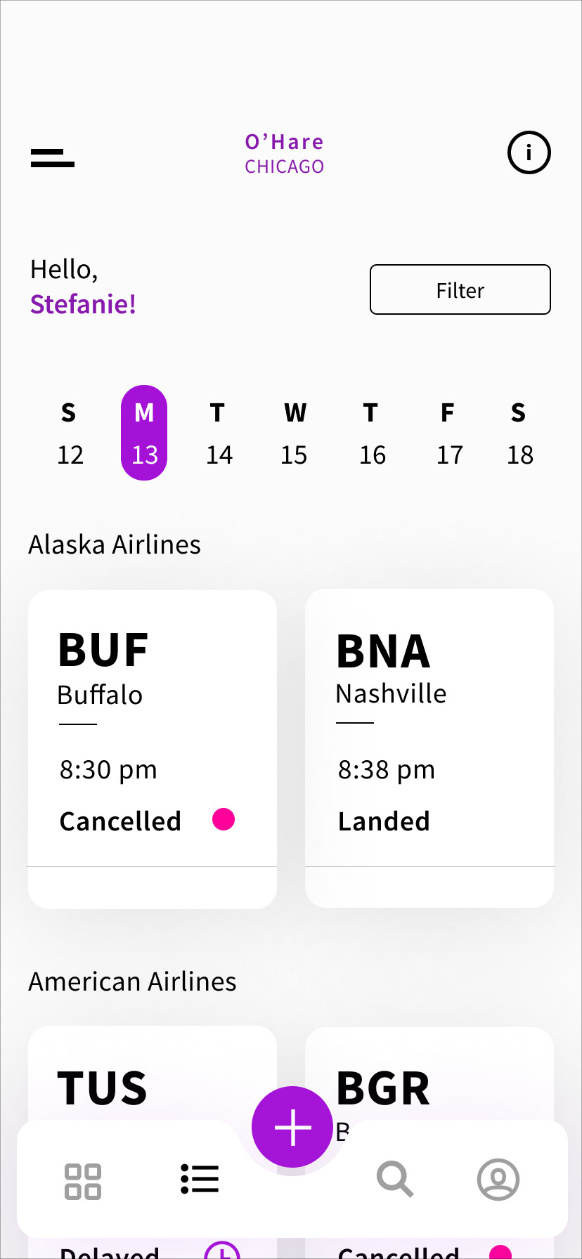
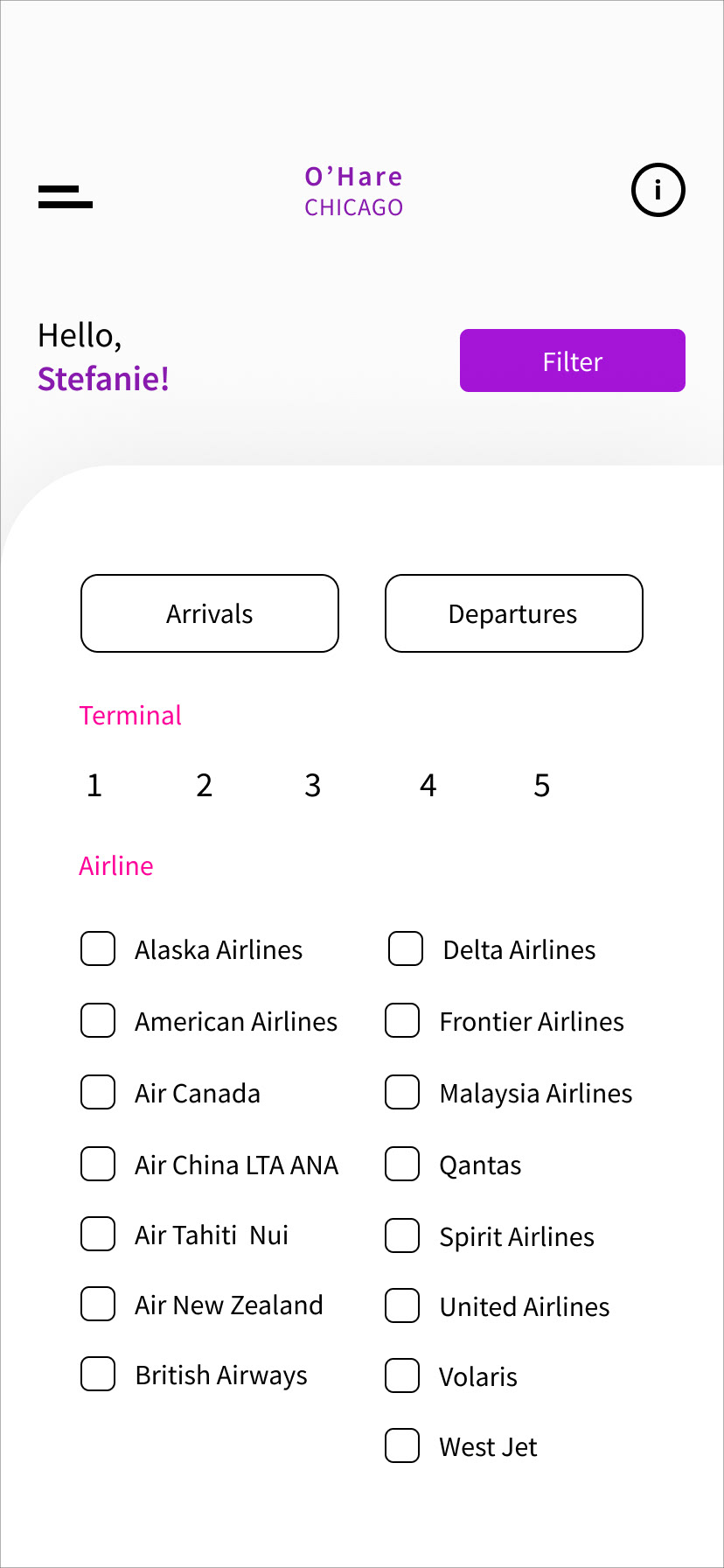
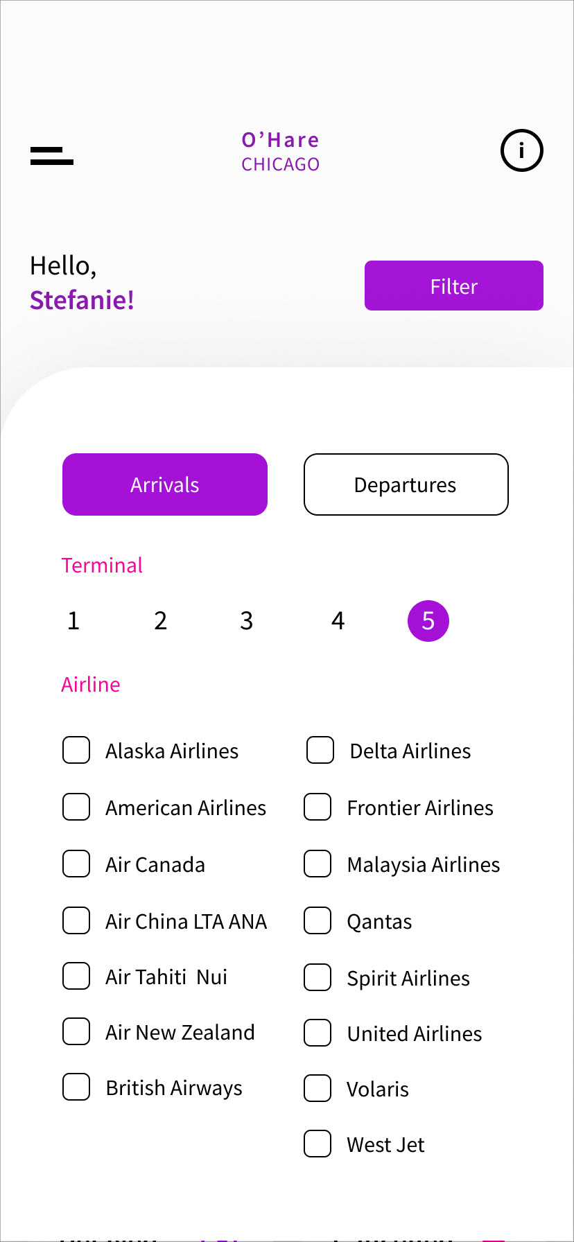
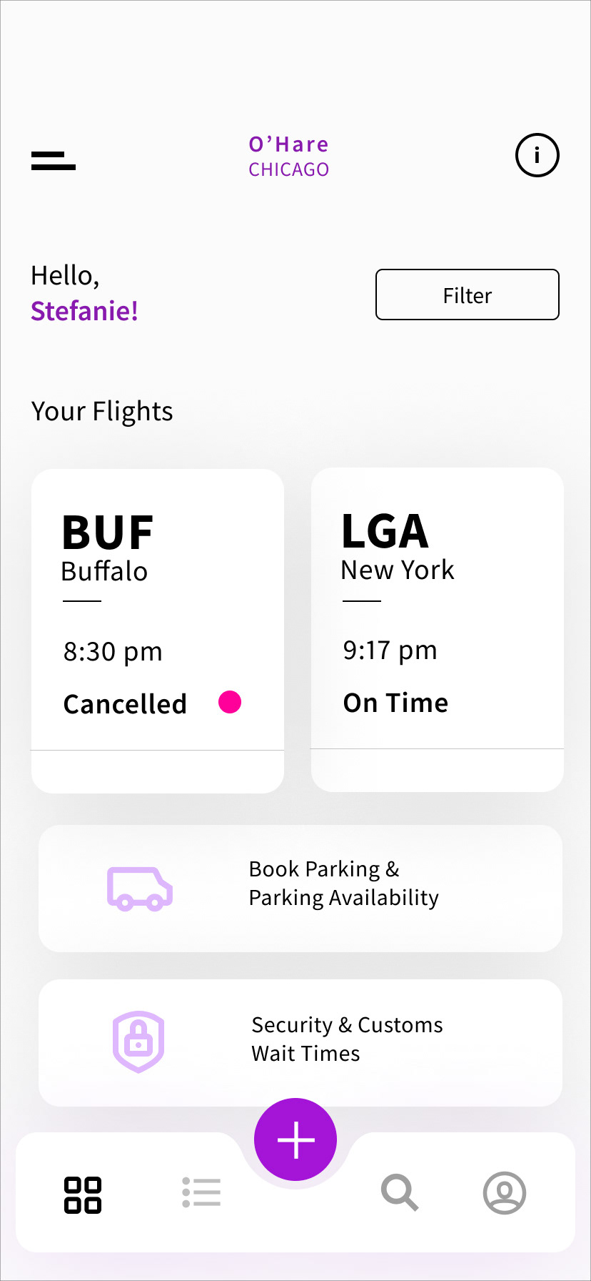
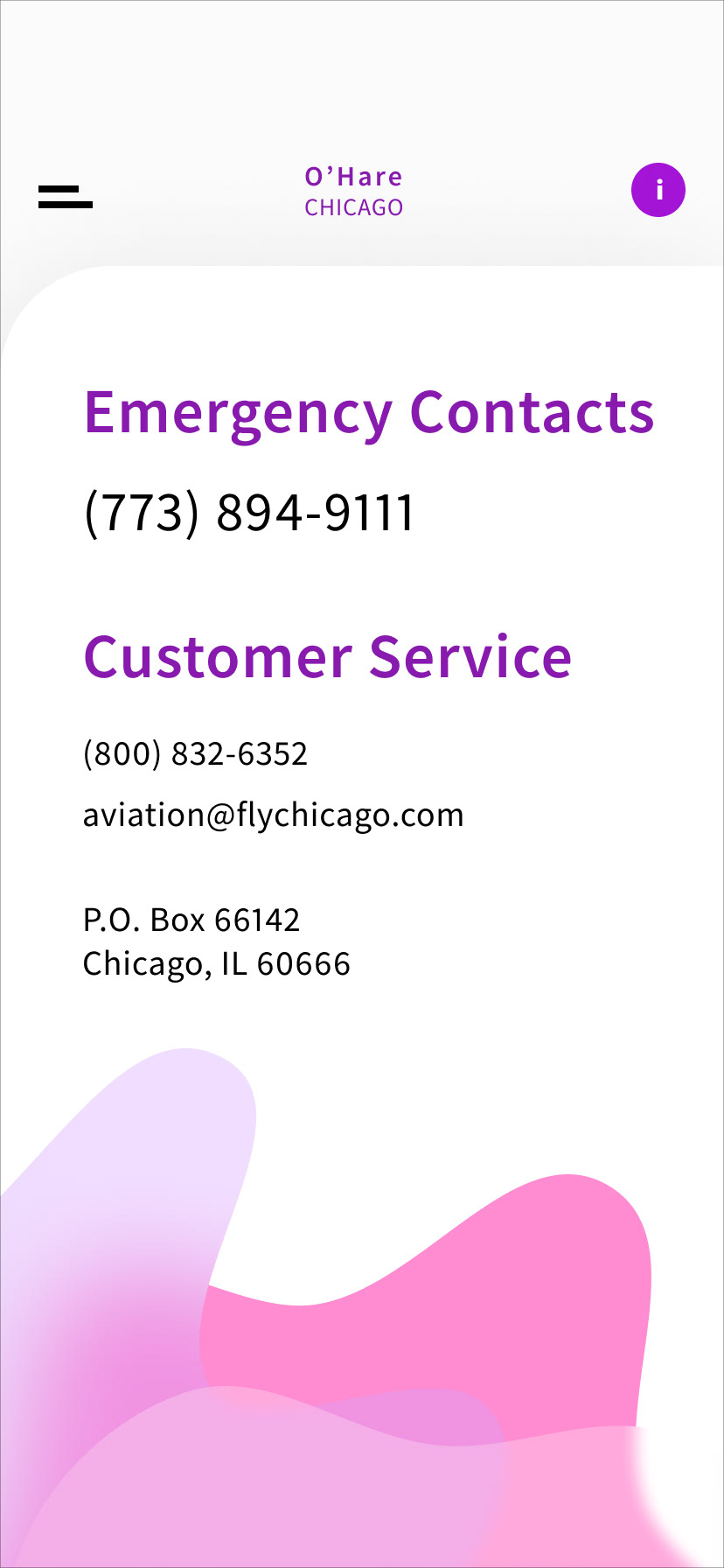
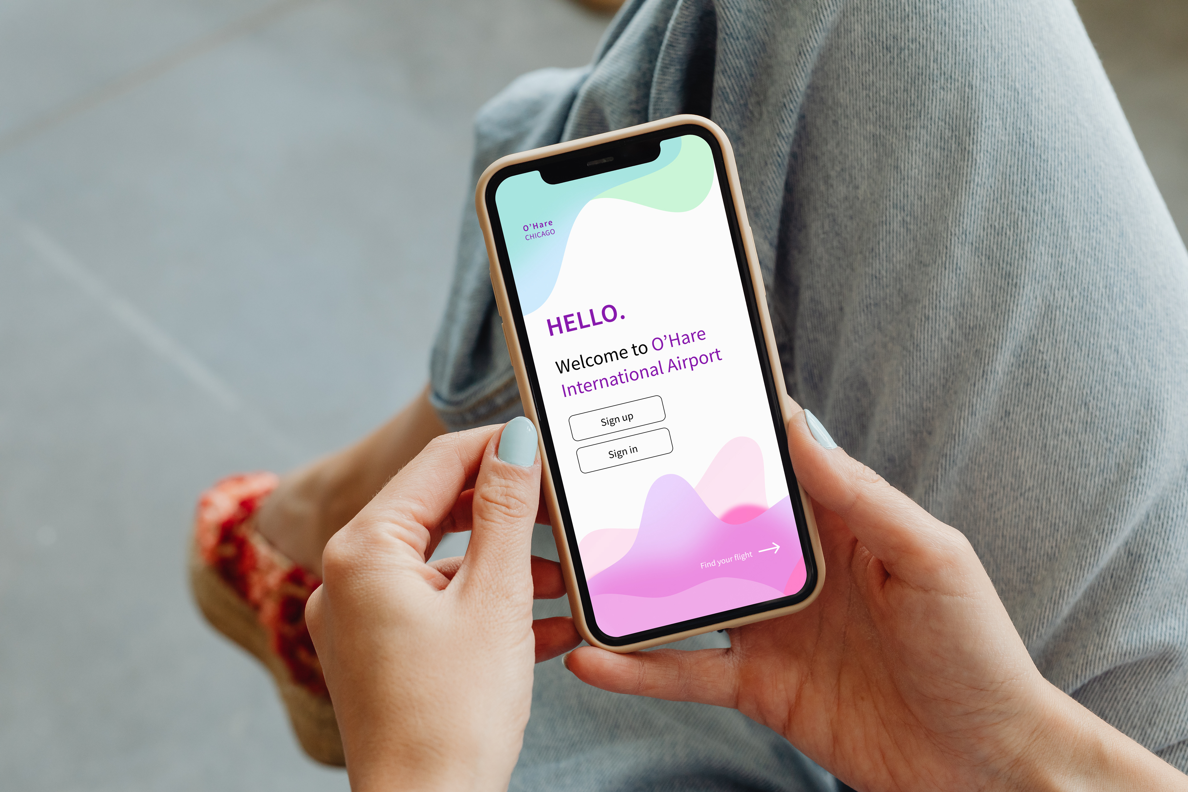
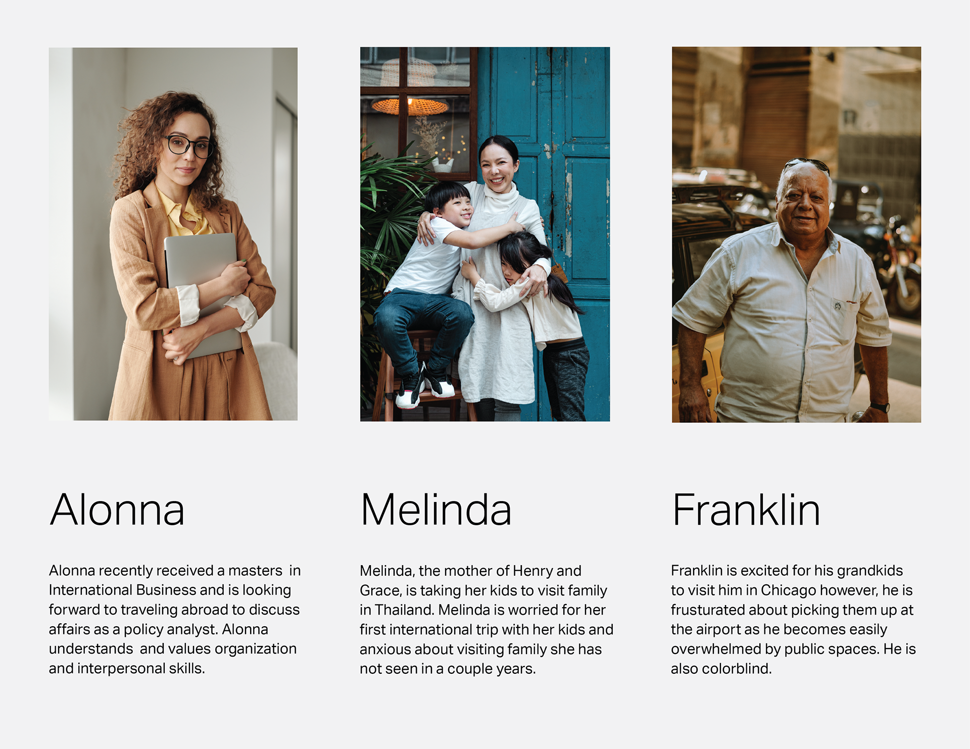
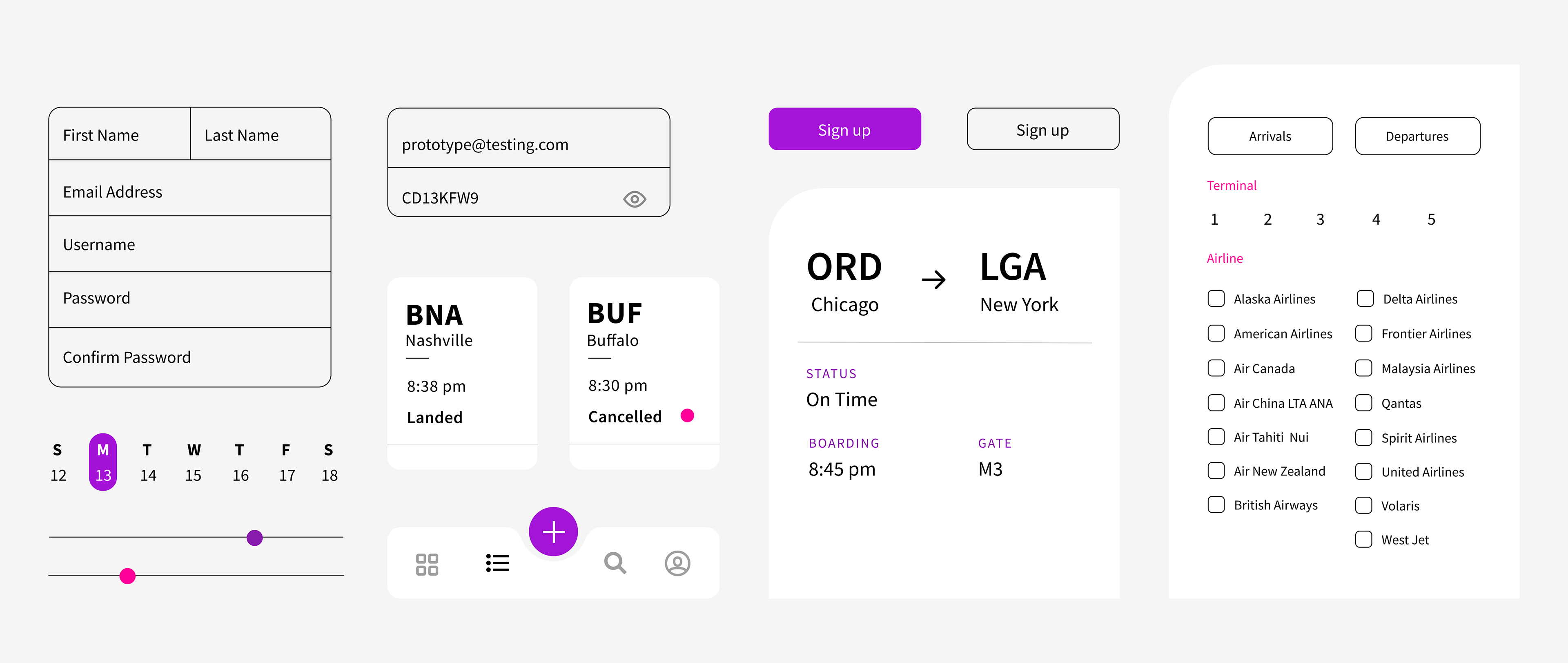
Exemplify a clear visual and typographic hierarchy that will be applied to an airport information system on a mobile phone. Focus on communicating complex content from numerical data to symbols and consider the myriad of people that will interact with this design.
Evericons are used on final designs.
Deliverable —
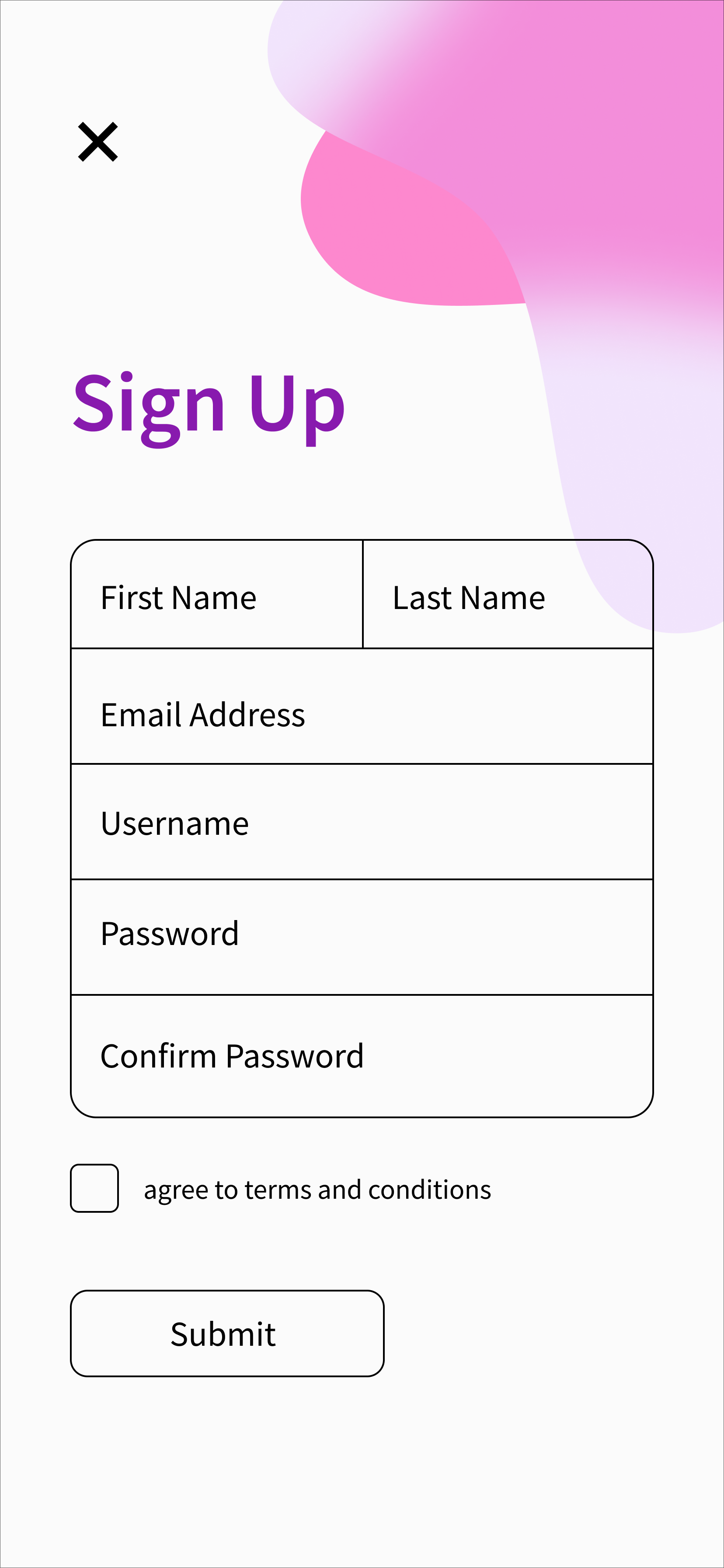
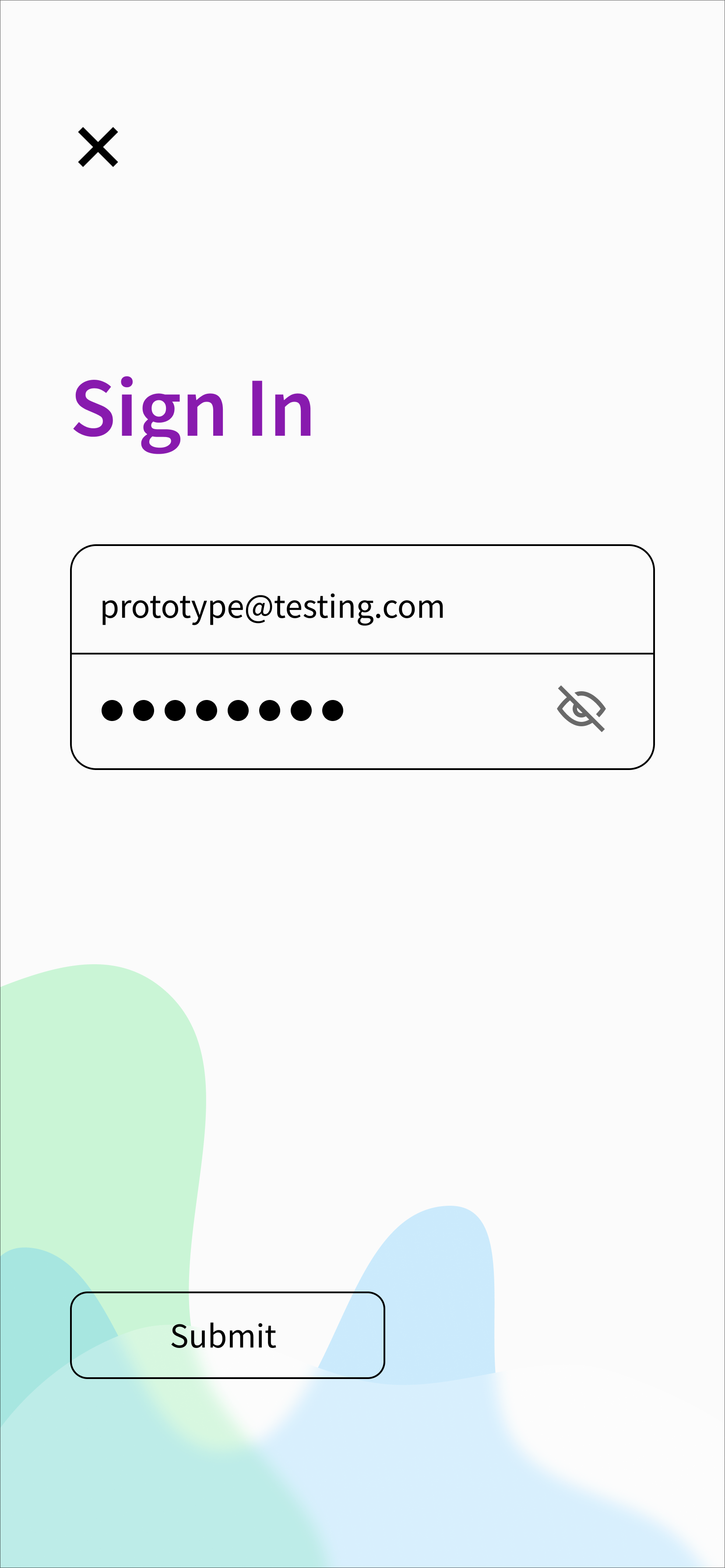
User Interface
Typographic Hierarchy
Style Guide
Lorem Ipsum
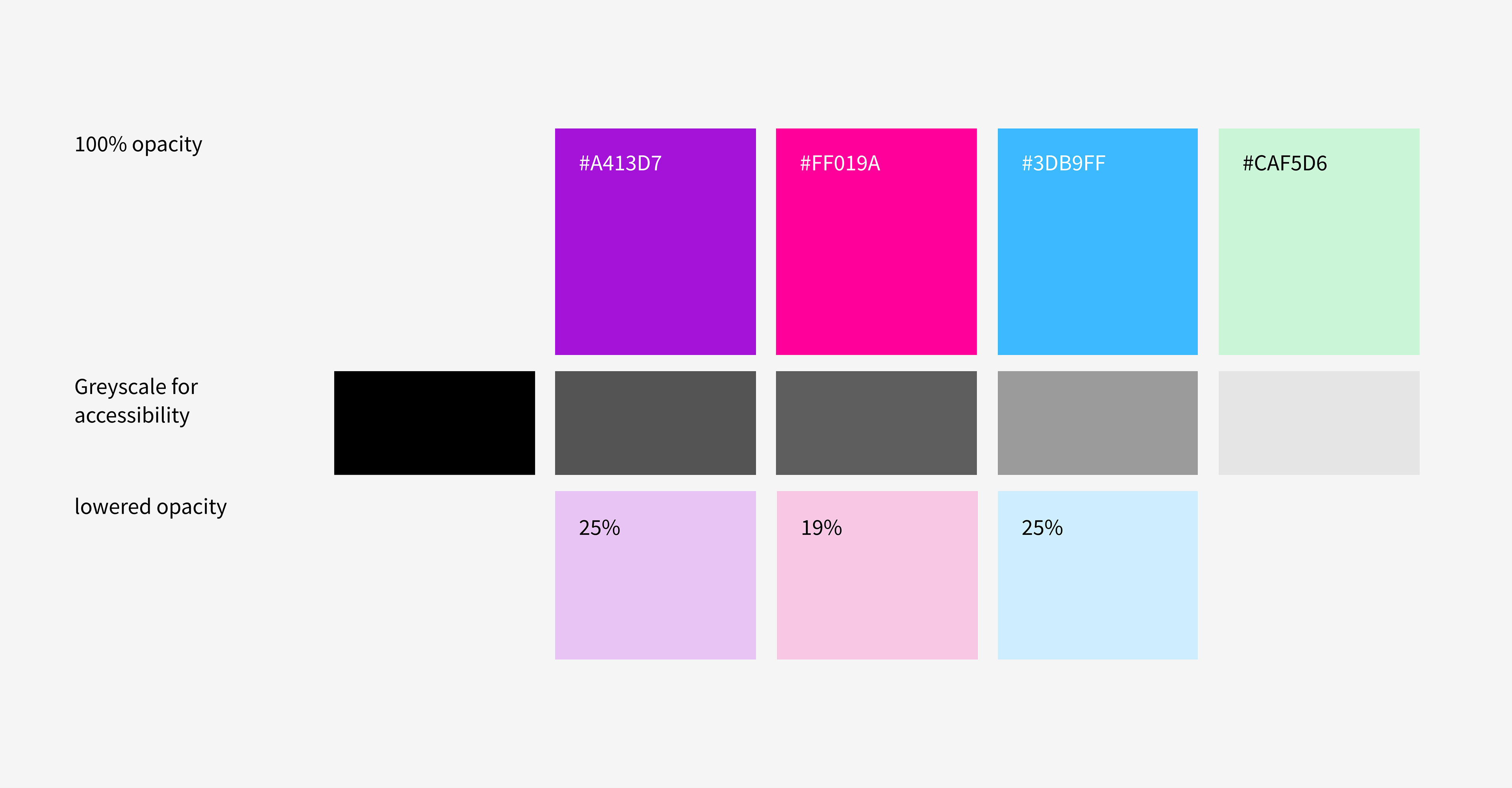
Type & Color
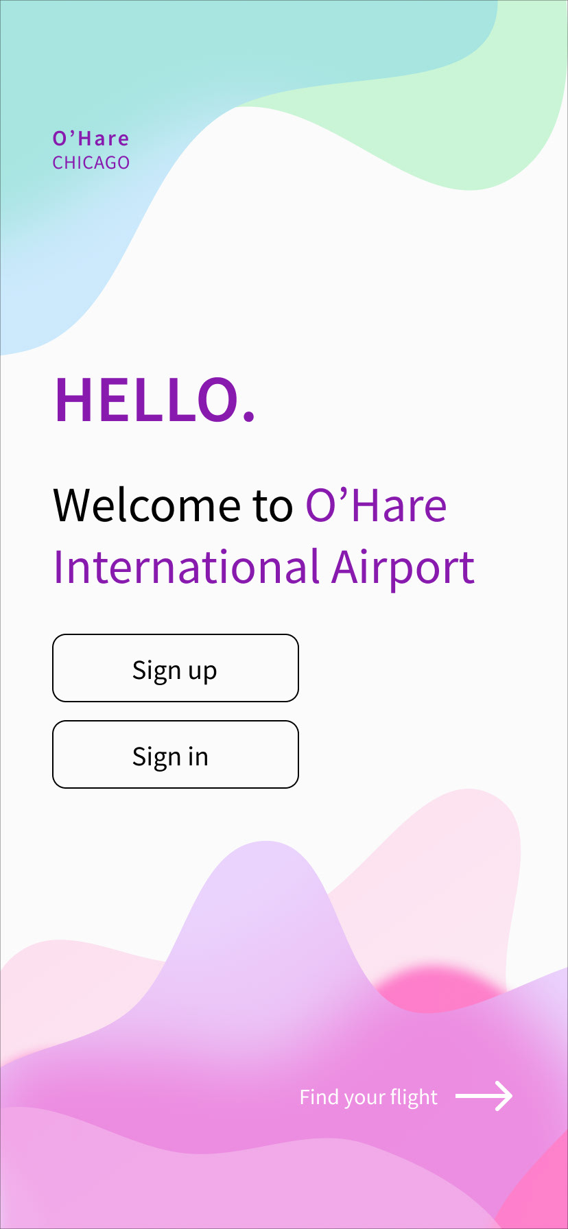
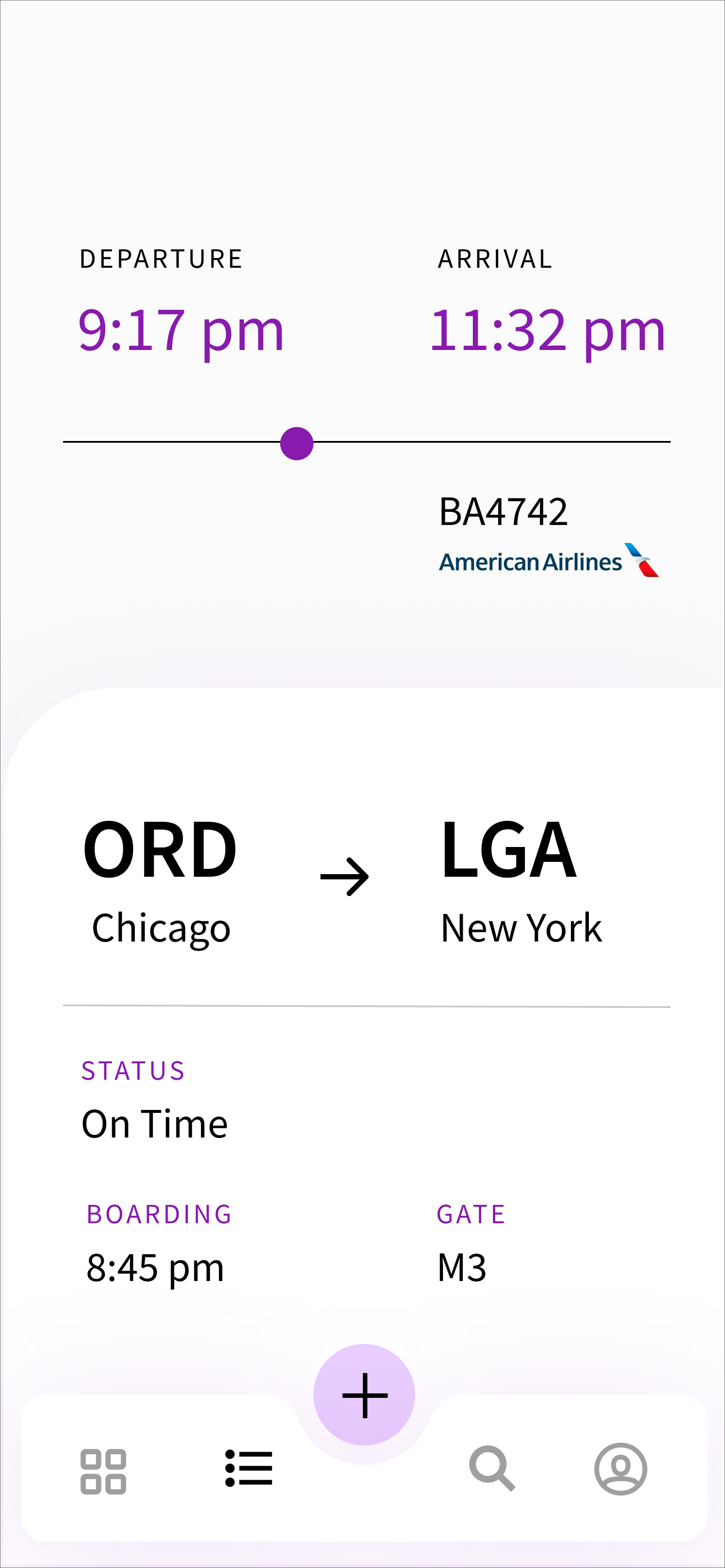
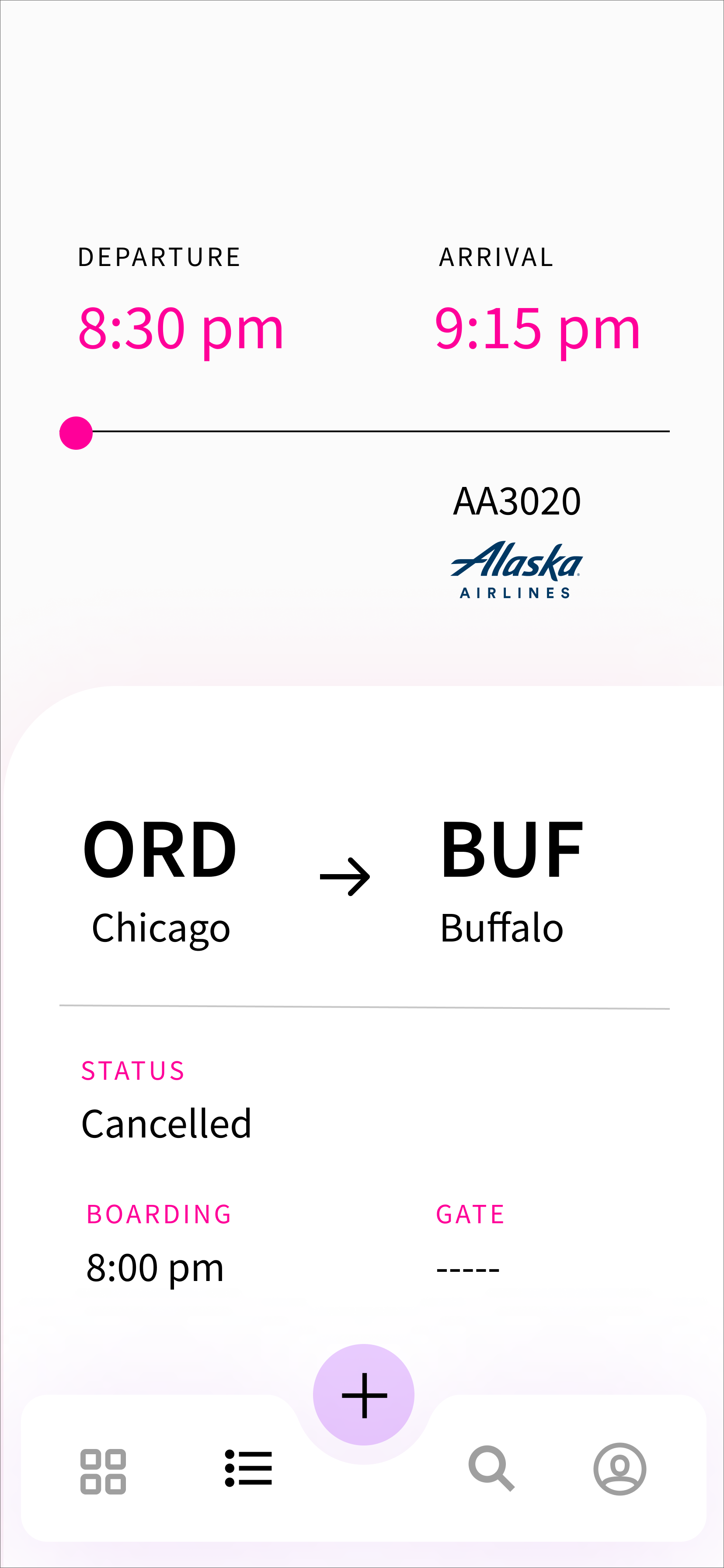
In the world of airport design there seems to be an emphasis on darker and heavier colors — likely to build trust between consumer and airline. I asked the question "how might O'Hare differentiate itself from the airlines that it houses?"
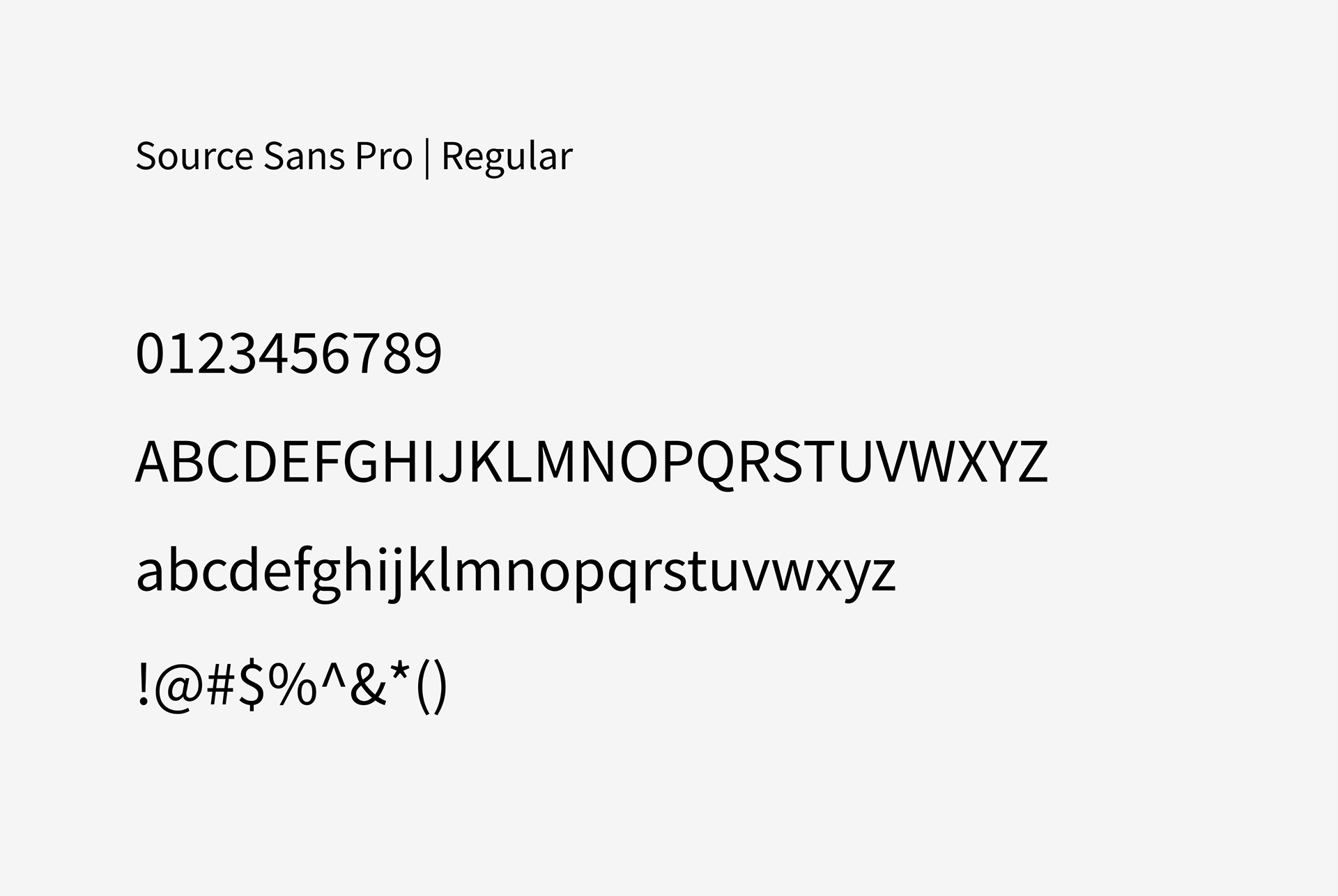
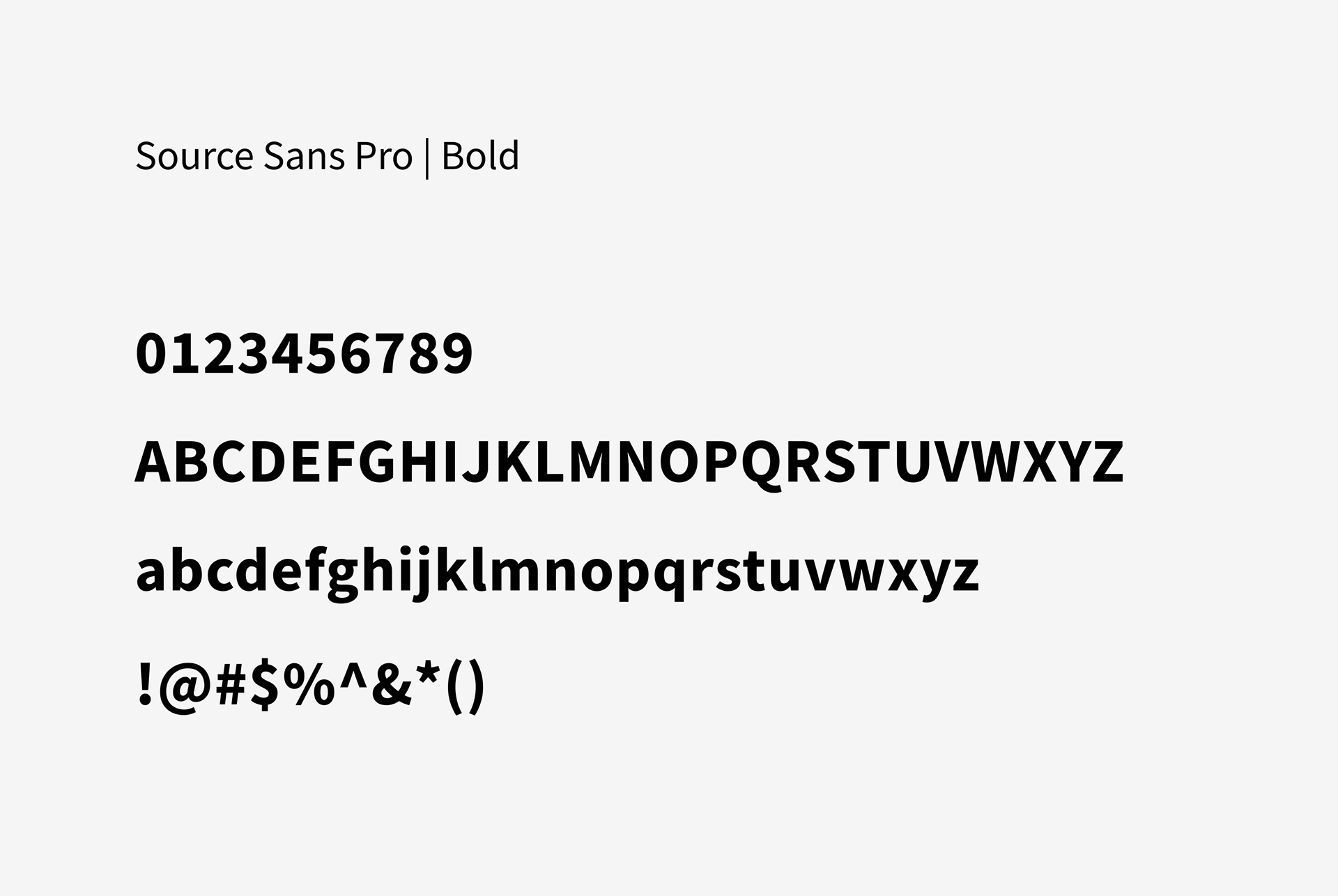
Additionally, Source Sans Pro was chosen for its wide variety of weights and supported languages.


Central Graphic Element
Throughout the strategy there was a focus on turning a stressful experience into one that's more playful, calm, and organized. After doing research into glass morphism I explored how this trend could become more accessible and add to the visual strategy by through color and asymmetrical overlapping placement.
Lorem Ipsum
Style Guide
Lorem Ipsum
Final Screens